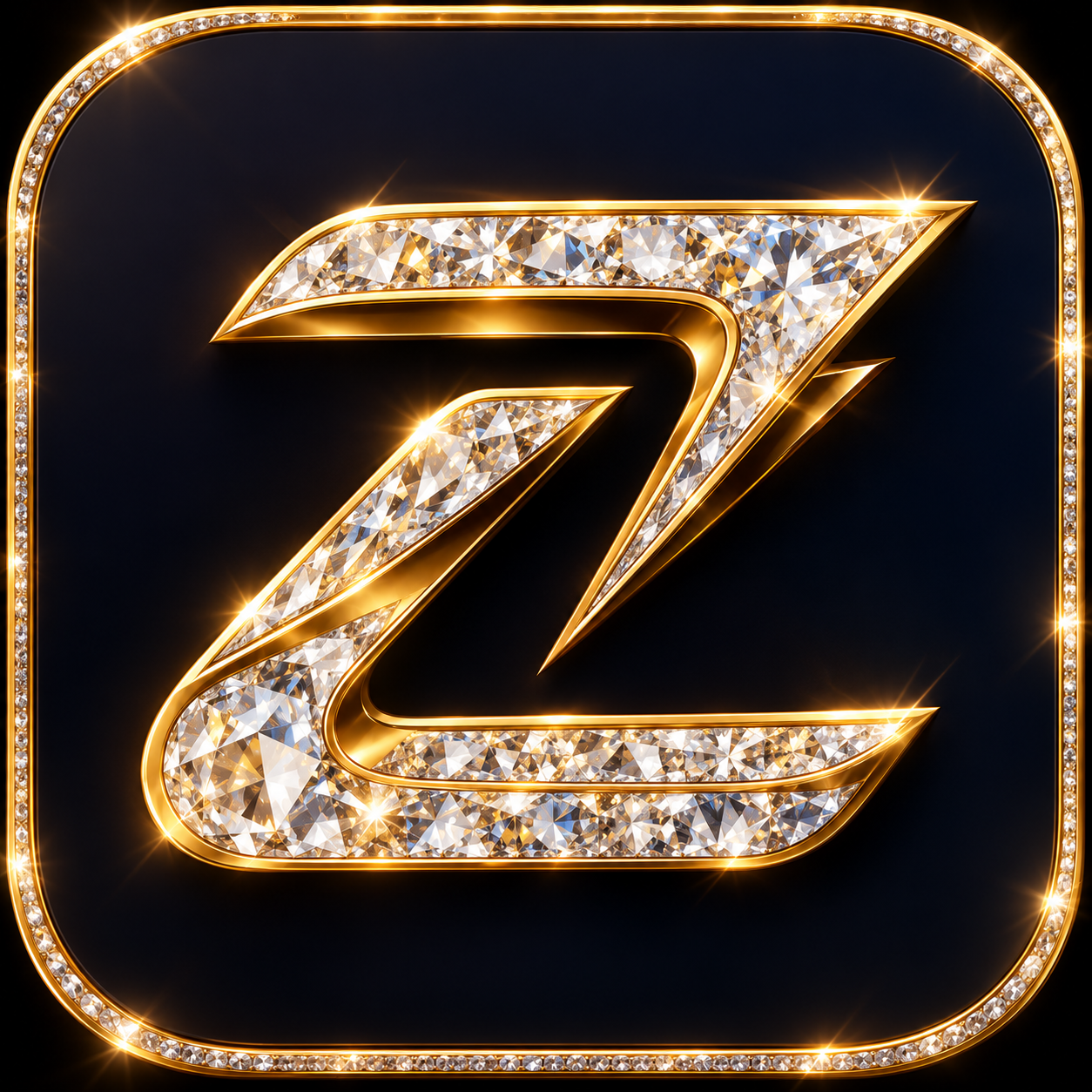
Gold diamond Z
Primary. Obsidian tile, gold rim, full wordmark. Digital hero surfaces, packaging, signage. Minimum tile 40px.
Brand kit
One monogram, three official builds. Every surface the house touches — a boutique window, a woven care label, a licence plate, an app tile — uses one of these three and nothing else.
Primary. Obsidian tile, gold rim, full wordmark. Digital hero surfaces, packaging, signage. Minimum tile 40px.
Single ink, drawn in currentColor. Embossing, foil, engraving, newsprint, invoices, co-branded partner walls. Minimum height 24px.
Heavier strokes, no wordmark. Favicons, app tiles, hardware stamps, zipper pulls, button hearts. Legible down to 16px.
Obsidian
Primary ground
var(--obsidian)Soft Gold
The Z mark, accents only
var(--gold)Ivory
Type on obsidian
var(--ivory)Charcoal
Panels, dividers
var(--muted)Do
Keep clear space of one full diamond width on every side.
Don't
Never crowd the mark with type, badges or product edges.
Do
Use the gold build on obsidian or deep imagery.
Don't
Never place gold on light grey — use the monochrome build.
Do
Switch to the small-icon build below 32px.
Don't
Never shrink the full lockup until the wordmark breaks up.
Do
Reproduce the wordmark in Cormorant Garamond, 0.24em tracking.
Don't
Never re-set, stretch, outline, rotate or recolour the wordmark.
Every Zipper Vibe object carries the Z and, somewhere quiet, a small passage of African cloth — a cuff facing, a zip pull tape, a lining panel, an inlay no wider than a thumb. The world's finest materials lead; the African thread is the signature that binds them. It is never the whole surface, and it is never absent.